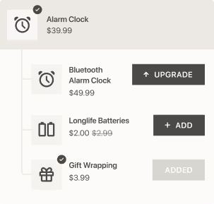
There’s a new customization option in Candy Rack—you can choose a grid layout for your upsells and cross-sells. It works for both pre-purchase upsells (triggered by the add-to-cart button on a product page) and post-purchase upsells (displayed on the thank-you page).
Why try out a grid layout
The design of your offer plays a crucial role in grabbing the attention of customers. And it might be the case that a grid layout will be more attractive to your audience.
First of all, grids can help you accentuate the visuals of suggested products. Also, research has shown that a grid layout positively affects the perceived aesthetics of an online store—for instance, a study on e-commerce site search revealed that a grid layout performed better than a list.
Given that a grid layout is commonly used in the design of stores, it can be perceived as familiar and convenient for shopping. Plus, it can look more consistent if you’re applying a similar layout in other elements of your store. Anyway, you can experiment and see if you get higher conversion rates.
How to set up a grid layout in Candy Rack
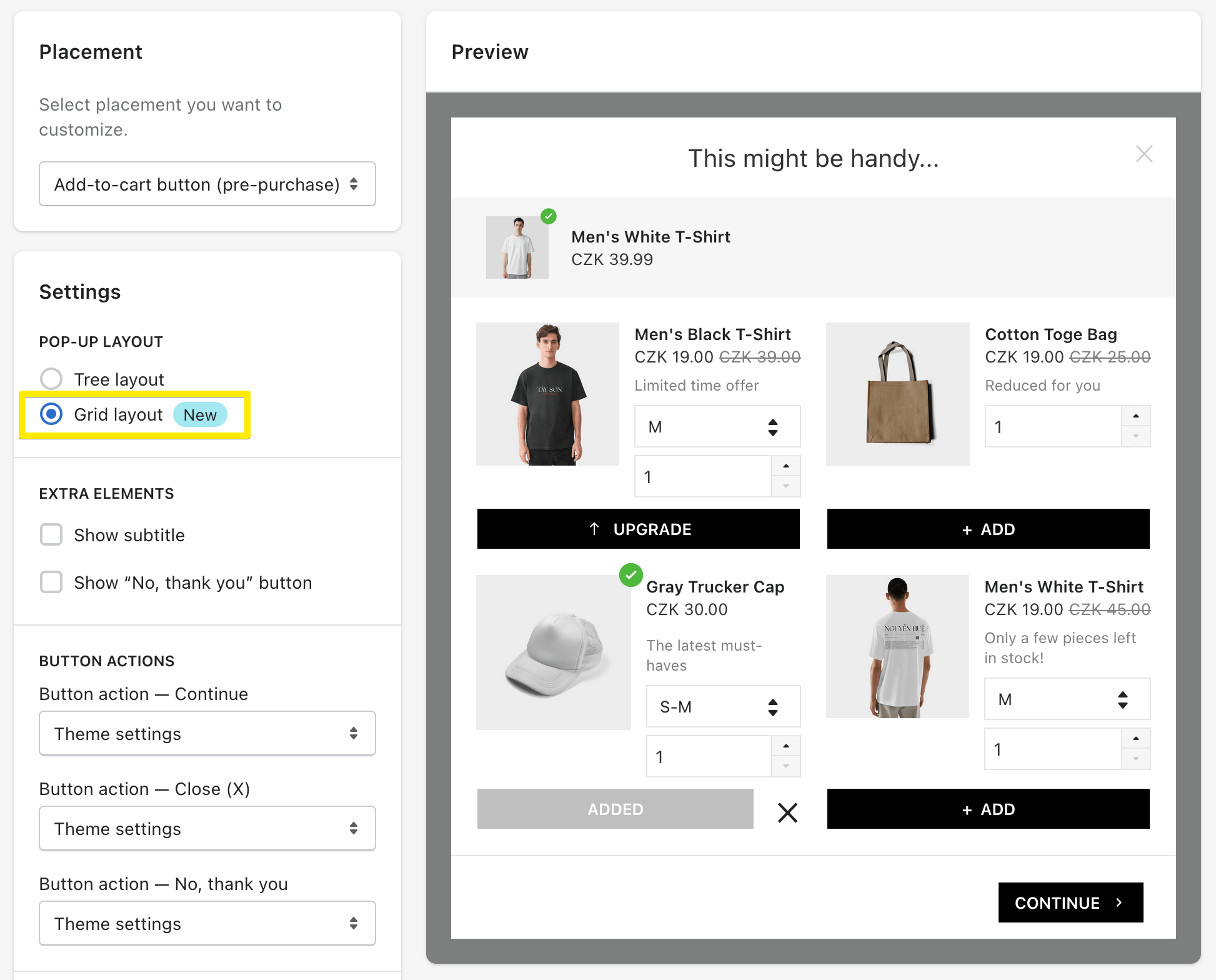
In the Candy Rack app, go to Customization > Pop-Up Layout and choose Grid layout:

All customization possibilities remain the same with a grid layout: you can adjust the buttons, modify colors, and change the pop-up’s title. The grid will also show the description of each suggested product (which you filled out in Upsell Configuration), a quantity selector (if you choose to display it), product variants (if there are any), and discounted prices (if you applied discounts).
Experiment with the settings, and happy upselling!
Not using Candy Rack yet? Try out for free.
Wondering how to improve the conversion rate of your upsells and cross-sells? Check out our article about 5 upselling strategies that are proven effective with the merchants utilizing Candy Rack specifically.


.png)