Brands and online stores selling home goods experienced a major growth during the Covid pandemic. People started thinking more about redesigning and decorating their living spaces for several reasons: they started working from home, stayed in quarantines, and started spending more time at home in general. According to the analysts at Common Thread, the expansion of the household goods market is not going to slow down—in 2022, it is expected to grow by another $30 billion globally (same as in 2021).
In this post, we’ll show you 3 of the best household Shopify stores and explain what they are doing well on their websites. Read on to gain inspiration for your own store or just to know where to buy goods for your home.
1. Our Place
Our Place is a brand focused on high quality and ethically produced kitchenware. Our Place products aim to bring a new spark to home cooking and bring people together through shared meals at home. The brand launched its first product in 2019, and now the average monthly traffic of the store is around 80,000.
What does Our Place do well on their store?
Navigation
- Navigation has a very clear mega menu right in the first tab and then includes separate links to the best performing products. This helps a significant portion of users find their way to the "winning" products and increase conversions.
- The icon with the number of products in the cart is highlighted compared to the rest of the elements in the navigation. This naturally draws the customer to the cart more easily after adding products.
- The announcement bar in the navigation is dynamic and has 2 different lines of content. The store doesn’t have to mention 2 types of benefits in multiple places, as they are constantly visible in the announcement bar.

Homepage
- Clear hero banner with the right hierarchy of buttons, discount message and emphasis on the visual side of the product. All this supports the highest possible conversion of the banner.

- Section with publications in which the brand was featured. A great way to show social proof, boost trust in your brand, and thus increase conversions.

- Section with the product broken down into its individual parts. A great way to visually show the benefits of the product and each of its parts. Our Place also displays possible colors, which helps users find their preferred product variants more easily.

Product page
- The emphasis on the reviews right under the product title is very important here, as this is where the user has to decide if they will actually buy the product. Reviews are a great type of social proof that incentives purchasing decisions.

- Assurance of a non-problematic fulfillment process. Customers always want to know if there are any guarantees in case of a product defect or how quickly they will receive the order. The product page is a good place to inform customers about these guarantees. Our Place displays the information on free shipping, 30-day return policy and free returns, which all have a significant impact on conversions.

- Reminders of product benefits in the main section of the product page. This short copy reassures the customer on why they want to buy the product.

2. Eddi
Eddi is a brand selling soap in recyclable bottles and reusable dispensers. Eddi puts great emphasis on sustainability, repeated use of their products, and recyclable material (aluminum). They are trying to change the trend of buying disposable soap in packages made of plastic. Eddi launched their store in September 2020 and has had massive success in pre-orders.
What does Eddi do well on their store?
Navigation
- Eddi’s site structure and navigation are simple and minimalistic. The user can find all the products from the main page and also very quickly get to the pages that explain the main aspects and benefits of Eddi—such as "Our Materials" and "How it works?".

- The "Shop" menu is very comprehensive thanks to visuals, so a customer knows where to click without even reading the names of different sections. This simplifies the user experience the entire store.

- Announcement bar content focuses on product discounts and free shipping. Again, customers have fewer barriers to purchase after seeing these benefits. Plus, clicking on this bar takes a customer straight to the product page, which increases the chances of a conversion.
Homepage
- Eddi highlights product benefits throughout the homepage so that users can see them in whatever part of the page they are currently on. Store visitors are constantly being reminded why Eddi is the right choice and purchase.


- The homepage also includes a video section that educates customers on how to use and set up Eddi. This immediately clarifies common questions on how to use the product, which in turn eliminates more barriers to purchase.

Product page
- Eddi has a product page well-tailored for subscriptions. Subscriptions automatically include free shipping, and customers are immediately shown the amount they will save when paying for a subscription.

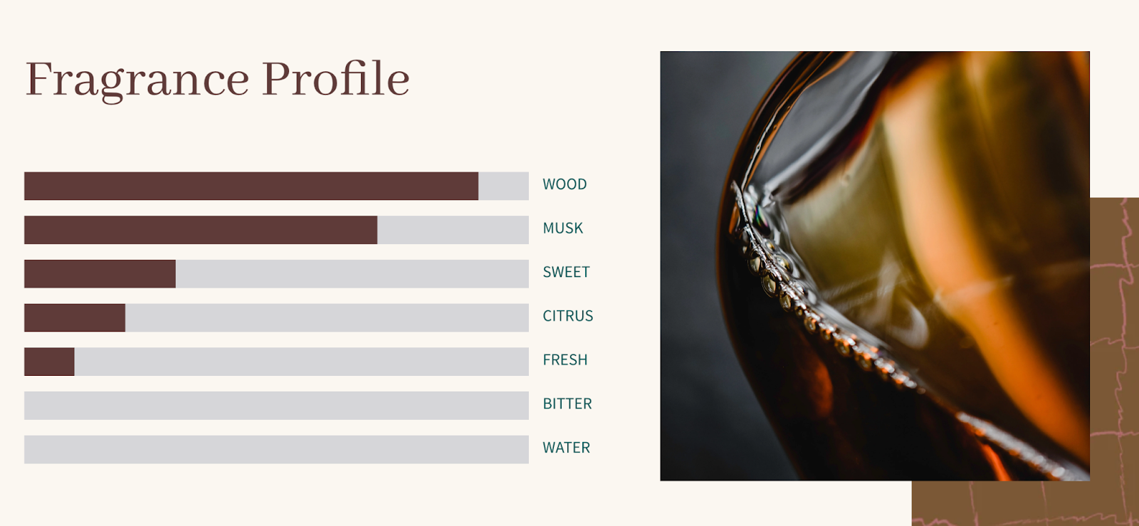
- Eddi also recognizes that the choice of soap is often based on its scent, which makes brick-and-mortar stores stronger competitors as they allow customers to assess the product in a real environment. To address this issue, Eddi features a section on the product page that describes each part of the fragrance.

- Product pages include a review section, which adds social proof and increases conversions.

Fluff Co.
Fluff Co exists to bring the luxury and comfort of 5 star-hotels into the homes of customers. Fluff Co sells exclusive yet ethically made pillows, robes, and towels. The company launched the store in the middle of 2020 and has been unstoppable ever since.
What does Fluff Co do well on their store?
Navigation
- Navigation on Fluff Co is very intuitive, products are categorized into collections based on activity, making it easier for users to browse the product offering.

- Navigation also includes a link to the quiz page that helps segment customers, collects 1st party data, and natively guides the user to an optimal product page based on their chosen preferences. Product recommendation quizzes are extremely popular with different brands now, so having one directly in the navigation is an excellent choice.

- Entire navigation, including the announcement bar, is "sticky," which makes it easier for customers to move around the store.
Homepage
- Hero banner on the homepage includes a certificate section, which gives customers social proof and confidence in the quality of Fluff Co products.

- Homepage also includes a section with Fluff Co products in direct comparison with competitors’ prices. This makes it easy for customers to see how much money they will save by buying from Fluff Co. Also notice how the "cheap" price of Fluff Co is highlighted and the section immediately includes an add to cart button.

- When you arrive at the homepage, you will see a video widget in the bottom corner where the site automatically plays UGC (user-generated content)—videos in which customers talk about the benefits of Fluff Co products. This way, store visitors are constantly provided with social proof and naturally have more confidence in presented products.


Product page
- The price is always shown as discounted on the product page. It’s not a discount from the original price of Fluff Co but a visualization of savings customers will make when purchasing on this store. By clicking on the "Suggested retail" link, visitors will land on the section where Fluff Co is positively compared to the competition, which increases the confidence in buying from Fluff Co.


- In the main section of the product page, there is also a table of possible discounts that come with buying several products. Customers will clearly see how much they can save.

- Fluff Co also has a FAQ section on the product page. When a customer is confused and looking for answers, they don’t have to leave the product page and can find the answers right there. This has the effect of reducing the chances of abandoning the purchase.
We hope this selection of Shopify stores and their website elements helps you get inspired to make adjustments to your online store and increase conversions!
If you’re planning to improve your store’s page design or the checkout process, explore our list of the best page builder apps and read our guide on checkout optimization.


.png)