1. New pop-up design
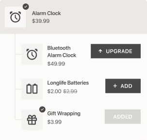
The first thing you’ll notice about the new Candy Cart is the updated pop-up design. Now it has smoother lines as well as slightly bigger buttons and images. We’ve also given you an “Add” button for the detailed product description. You’ll also see that the header and non-transactional “Back” button are less prominent. We’ve made these tweaks to put all-important upsell offers firmly in the spotlight.


2. New UI that puts your needs first
The next thing you’ll see is the changes we’ve made to the UI of the administrative system.. Now, it's more focused on the things that users care about most. For instance, you can now track your views, sales and take rate in the upsell Performance Overview. We’ve also removed the “transaction” metric from the overview since it was causing a bit of confusion.
The next UI change is the addition of a search field to the Candy Cart dashboard. This feature allows you to search for a particular upsell offer. This is sure to come in handy if you have lots of upsell offers and want to make changes to a specific upsell.
To keep things as simple as possible, the “targeting” column has been removed from the new version of the app. The status column has also been changed. Now you’ll see active and paused offers in two separate tabs, which makes it easier to navigate multiple upsell offers. To pause or activate an offer, just go to the offer details page.


3. New feature: "Enable quantity selector on the pop-up"
The no. 1 request from Candy Cart users was to have a quantity selector in the pop-up. And voilà, here it is! Just go to “Additional settings” to change the quantity.


4. "Display for" lets you target upsell offers with greater precision
In this new version of Candy Cart, we’ve removed the option that allowed you to target collections and products in the one offer. Now you’ve got greater flexibility. You can choose to target “all products”, “specific products” or “collections”. Whereas on the old version of Candy Cart you could only target 2 collections at a time, now you can target an unlimited number of collections.


5. New feature: "Don't display if product has already been added to the order"
This is one of the most exciting new features we’re rolling out. When you tick this option, you can be sure the upsell offer won’t get displayed if the product has already been added to the order.

6. Faster analytics
You’re going to love Candy Cart’s new analytics, which work much faster now. We’ve also made a couple of changes to the names of our metrics. Now when you go to Analytics, you’ll see:
- Views (total offers viewed)
- Upsells added (total upsold line items added to orders)
- Upsells sold (total line items upsold and paid)
- Sales (total sales of upsold line items successfully paid)
- Take rate (ratio of upsells sold/paid to upsells viewed)
Also, the former metrics “Add to Carts” and “Transactions” have been replaced with “Upsells Added” and “Upsells Sold”, respectively.
In the new version of Candy Cart, you’ll notice we’ve added a new “Currency” field to the “Detailed export report”. This is available for new orders only.


We really hope these new features and improvements will provide you with a much better app experience. If you have any questions or suggestions, we’d love to hear from you. We’re always looking to incorporate your valuable feedback 👐.
By the way, if you are not sure what to upsell or cross-sell, make sure to checkout our guide 10 Proven Upsell & Cross-sell Strategies on Shopify.


