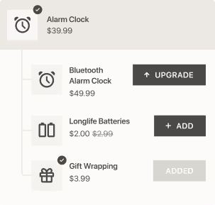
At Digismoothie we strive to provide a top-notch user experience. That’s why by default all our apps are slick and simple. Both from the backend and frontend sides. But we are always limited as we need to come up with one solution fits all design.
And that’s why we have decided to offer an extra service of tailoring the Candy Rack upsell pop-up to match the storefront. That should provide a seamless user experience and better integrate the pop-up to the whole purchase flow. And of course, eventually, lead to higher upsell take rates (conversions).

Default Candy Rack upsell pop-up design/layout on desktop
We have tried to educate our merchants by providing a guide on how to change the pop-up design using CSS. Unfortunately, we don’t see high adoption rates.
So we are now offering this as part of our service. At some point, it will likely become a premium one-time payment service but for now, we are offering it for free to all our merchants. If you are interested, simply contact us using the in-app chat or contact form.
All changes are implemented using CSS and can be easily reverted/adjusted by the store owner via the app settings. We also do it remotely, so we don’t need any access rights to your store.
Examples of our work
Here you can find some real examples of how we customized the default pop-up.


