1. Interactive video widget
The video widget has been a popular functionality for over half a year. Big e-shops use it for two reasons:
Customer education
The video widget is a great way to educate the customer about your product and brand. The video easily captures their attention, and the interactive element of the widget ensures that the customer doesn't just walk away from it.
In the video, for example, you can talk about the brand and its beginnings and describe what problems your product solves or helps the customer with. This will help the customer associate the brand with a real person, remember it better, and know exactly why to buy your product.
Omsom uses its video widget mainly to educate the customer and start a relationship with the brand.

Optimizing the buying process
Once you've introduced the brand to the customer, move on to the product presentation. Explain the main benefits of the product and add the possibility to make an interactive choice, for example, by clicking on other types of your product or using a simple questionnaire. The customer then chooses a relevant product from a shortlist that solves their problem and that they have selected according to their criteria. The conversion rate tends to be much higher with such buying processes than with the traditional shopping journey.
What's more: You make the buying process easier for the customer because they don't spend dozens of minutes searching the web, browsing all the collections, or reading the FAQ page.
The Omsom widget concludes with a short questionnaire that filters the products for the customer and makes the conversion easier.

Who should be involved in video content?
The video widget works best with two types of personalities: the brand founder or the influencer/brand ambassador. These personalities have an authentic effect on customers, and people are more inclined to listen to the end.
Can I use a video widget in other ways?
Yes! For example, you can use a video widget as a social proof tool. Just add a video of your fan to the widget where they briefly explain why they love your brand or product. Such social proof will have a great effect on conversions, among other things.
How to implement a video widget on my e-shop?
We recommend you try the Tolstoy app, which has a newly created integration with Shopify as well.
2. Reviews directly in the navigation
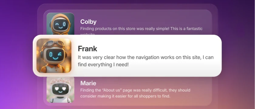
Reviews directly in the navigation are proof of the effectiveness of one recurring element: social proof. The experience of other customers is crucial for e-store visitors and people shopping online.
If you're already collecting reviews, add a page with all the reviews directly to the navigation. An e-shop visitor can check your reviews right from the start, and this will encourage them to buy from you.
For example, the Clevr brand uses the link to the reviews page directly in the navigation, which increases conversions and trust in their supplement products.

Another reason why a link to reviews directly in the navigation works is transparency. For the customer, it is a clear sign that you are proud of your product and have nothing to hide. And for you, it’s another way to show the customer how good your product is.
3. Landing pages
Landing pages have become the center of attention lately for several reasons. But first, let's understand what the term landing page means.
What is a landing page?
A landing page is a page created to optimize your marketing efforts and get the best possible result from your ads. So if you run a Facebook ad, for example, with content focused on a discount on one of your products, the landing page would be the page to which the ad leads, with content focused purely on the discounted product and the discount itself. Conversion is much higher on this page than if you drive traffic from the ad to a traditional product page or even a collection page or homepage.
The landing page of the Hydrant brand, to increase the success of the marketing campaign, targeted the discounted product.

Landing pages have been around for a long time, though, so why are they only now coming into the spotlight?
iOS 14.5 update
The iOS 14.5 update and other restrictions on data use for user privacy reasons have severely limited the effectiveness of Facebook and Instagram ads. For many merchants who drove the majority of visits to their store through paid ads on these platforms, this has greatly increased spending and decreased results (number of visits, conversions, impressions, etc.).
If you can't influence the effectiveness of ad targeting, how else can you make your ads more successful? On the e-commerce side, it's through landing pages. Landing pages with similar content to your ads will get you a much higher percentage of conversions than driving customers to a generic product page. A landing page can make your point of view more clear and more supportive of the product in your ad.
Economic crisis
Unfortunately, the world of e-commerce is now being negatively affected by several economic and political factors that are causing customers to be less interested in buying ancillary products.
Larger e-shops and retailers have quickly realized the need to get the most out of every visit and impression and have started to focus on the constant development of just landing pages.
How to build custom landing pages quickly?
There are tools you can use for your business without the need for code development! Landing page apps on Shopify, such as GemPages or Shogun, allow you to develop landing pages with no external help.
These apps are a great solution if you're currently looking for ways to optimize your buying process or marketing without much cost. However, you'll need some coding to create landing pages with superior design or functionality.
4. Customer Quiz
Quizzes are another element of e-commerce that has been popular for some time, but its performance is not waning. What is a quiz good for?
Optimizing the shopping process
Just like an interactive widget, a quiz is also a great way to "pave" the customer's way directly to the product page. A quiz is a better path in terms of conversion optimization because of its ability to personalize.

The Disco brand uses a quiz to increase conversions and, most importantly, to facilitate the buying process for a product as personal as skincare.
You can stuff a quiz with questions that, when completed, will lead the customer to a highly filtered product offer. The customer is then confident that the filtered offer has been tailored to their needs. The interactive element of the quiz (clicking your answers) is fun for customers, which also relieves them of the need to search for products, research them or read the usage carefully.
The result is increased purchase conversion by a significant chunk.
Reducing the chances of a bad product experience
With a very well-structured quiz, you can also reduce the number of product inquiries and or bad customer reviews/ratings. If your product offering varies widely and not every product is suitable for everyone—as with skincare—customers must have all the information and buy the product designed for them. If they buy a product that is not designed for them, it will cause potential customer support queries, poor reviews, and unnecessary loss of future purchases.
A well-built quiz can help you prevent these types of purchases, increasing LTV and customer satisfaction. Learn more about customer segmentation from our article.
5. Product bundles
Bundles are another functionality that is becoming more and more used. Why are bundles popular, and what benefits do they bring?
Increased average order value
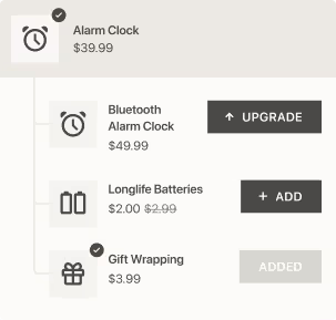
Bundles are one of the most organic and effective solutions to upsell products and increase average order value. With a tiny discount or promotion, you can raise the value of some customers' orders by as much as double the price of the originally planned purchase.
Increased conversions
Bundles have the added benefit of reducing product search time. If a customer comes to your store already determined to buy multiple products, they have to click one by one into their cart. If they search longer and fail to find the products they are looking for in your offer, they may abandon the purchase altogether.
This is easily avoided by creating packages and adding them to relevant pages where customers can easily find them. Then you can "nudge" customers to buy the package with a small offer/reward, for example, free shipping or a 5-10% discount.
More conversions through interactive package composition
The so-called bundle builder has become a popular tool for marketers. The main reason is, of course, to increase conversions. The bundle builder is a separate page offering the free creation of a bundle from the products you choose. The customer simply selects the number of products, the variation of the bundle, and also the reward they want to receive.
Through the bundle builder, you can scale different types of rewards according to how much the chosen bundle costs. You can offer free shipping for a selected bundle at a price of $40, with a bundle costing $75, for example, a gift with the purchase.
Bundle builder has several aspects that ensure high conversions:
- Interactive element: the customer selects the bundle of their choice, which is fun
- Reward gradation: the desire to get the highest possible reward
- Ease of the buying process: the customer does not have to search for the products and just needs to click on the relevant link in the navigation
Which e-shops to take inspiration from for your bundle builder?
Several e-shops use the bundle builder effectively and achieve great results with it:
- Huron, with its customizable bundle builder, achieved an 85-110% increase in AOV in the first five days after launching the builder. Even more surprisingly, the increase between regular and new customers was very similar.
Huron also uses bundles to support another type of purchase—subscriptions. Subscriptions with a customized package subsequently not only increase average order value but, more importantly, massively raises LTV (the total value a customer spends with your brand over their entire journey).

Huron highlights two elements in their bundle builder, the ability to deliver a regular bundle through a subscription and rising rewards.
- Outdoor voices use the builder to create an outfit. This helps customers imagine if their combination makes sense, making it easier for them to buy. In addition, the builder packages are separated by activity, so you can combine just outfits for sports, yoga, running, and more in one builder.
- Kind uses its builder, similarly to Huron, to increase subscription order values. But Kind has tailored the builder to different types of customers. Customers can select a bundle themselves or choose a predefined one. This makes a choice easier and increases the chance of a conversion.
Kind also encourages customers to make more purchases through the builder. The bar packs are only available in 20 and 40 pieces.

As you can see, the big trend is still the social proof focus and using more natural ways to increase conversions. Which functionality caught your eye the most?


.png)